This is my first design idea for my magazine contents page. It is very simple yet very effective as it will be easy for the audience to find their way around my magazine as the information on the content page is very clear. I have planned to use three small images alongside the text which will relate to the information given about what the reader will find in the magazine. I have chosen to put the masthead at the top of the page, again very simple but very effective and clear to the reader. The font would be in the same font as my front cover which is a 'graffiti' style in order to keep the same style throughout the magazine.
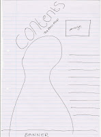
This is my second design idea, not as simple as the first idea but still effective. I have chosen to use a main image in the middle of the page, which would be effective as it’s eye-catching to the reader. Just underneath the main image is a banner, this will consist of artists that will feature in the magazine that relate to the hip-hop genre so the reader will be enticed to read on about their favorite artists. Alongside the main image is where the text would be placed this is an eye-catching area as the reader is already focused on the main image. Finally at the top of the content page is where the masthead would be placed, slanted slightly which is unusual but will again grab the reader’s attention. Just underneath the masthead is 'the real rap' this will be an ongoing theme throughout my magazine.
This is the last of my design ideas; it is busier than the others but is still very effective at the top of my page i had planned to use two large images both beside each other. This would be effective as it would appear eye-catching with ' the real rap' written just above the images that the reader will see appear on my front cover also. Just below the images is the masthead, although this is not at the top of the page like most content pages it can still be effective as the reader’s attention is drawn to the images the text is immediately below slightly over-lapping making them unable to miss it. I have chosen to split the text into two separate columns one for the features which will explain the new exclusive information they will see in the magazine and one regulars which will give information on the pages that would always appear in the magazine, this is effective as it gives the reader simple and easy information as to what’s new in this week’s magazine edition. Just underneath this text is a banner, this would consists of artists names that will feature in the magazine


No comments:
Post a Comment