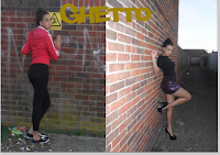
Firstly i chose my two main background images and pasted them into a black A4 page on Photoshop. I then had to find the middle of the page in order to make sure that my two photos were equal in size. After i had done this i texted to text tool in order to create my masthead which i was downloaded from www.dafont.com prior to the construction. when finishing i pressed the button in the shape of a tick in order for my font to stay the way that i had wonted it, also for me to take another step into the progress of my double page spread.
I then used the same text tool to write my interview, once i had written this i had to move it around several times in order to get it into the right positioning.
Once i had written up the interview, i had to change the colour of the last column as it was not very clear to read and changed the font to bold. i then used the text tool to write the summary at the top of the page in yellow along with the quotes written in red. Lastly i coped the music concert photo into the corner of the page and sued to opacity tool in order to make it blend in with the double page spread and look professional
Front cover
Firstly i posted my main background image into a blank A4 page on Photoshop. I then had to position the photo into the corner of the page. After i was satisfied with the positing of my photo i used the text tool to create the masthead which i had downloaded the font prior to the construction. Once i had done this i once again used the text tool to create my cover lines. Once this was complete i used the text took to change the colours of my font to match my chosen colour scheme.
Once i had completed the above task, i used the rectangular tool to draw a banner along to the bottom of the page. After this i used the text tool to write 'free iTunes download' were i had to move the layer on top of the shape layer in order to assure that the text was not hid underneath the banner. Furthermore i used the text tool to create the price and date of my magazine along with the barcode. However after this screenshot i had changed the positioning of the barcode, date and price in order to make my magazine more realistic and profession.


No comments:
Post a Comment