Sunday, 8 May 2011
construction process of front cover and double page spread
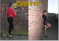
Firstly i chose my two main background images and pasted them into a black A4 page on Photoshop. I then had to find the middle of the page in order to make sure that my two photos were equal in size. After i had done this i texted to text tool in order to create my masthead which i was downloaded from www.dafont.com prior to the construction. when finishing i pressed the button in the shape of a tick in order for my font to stay the way that i had wonted it, also for me to take another step into the progress of my double page spread.
I then used the same text tool to write my interview, once i had written this i had to move it around several times in order to get it into the right positioning.
Once i had written up the interview, i had to change the colour of the last column as it was not very clear to read and changed the font to bold. i then used the text tool to write the summary at the top of the page in yellow along with the quotes written in red. Lastly i coped the music concert photo into the corner of the page and sued to opacity tool in order to make it blend in with the double page spread and look professional
Front cover
Firstly i posted my main background image into a blank A4 page on Photoshop. I then had to position the photo into the corner of the page. After i was satisfied with the positing of my photo i used the text tool to create the masthead which i had downloaded the font prior to the construction. Once i had done this i once again used the text tool to create my cover lines. Once this was complete i used the text took to change the colours of my font to match my chosen colour scheme.
Once i had completed the above task, i used the rectangular tool to draw a banner along to the bottom of the page. After this i used the text tool to write 'free iTunes download' were i had to move the layer on top of the shape layer in order to assure that the text was not hid underneath the banner. Furthermore i used the text tool to create the price and date of my magazine along with the barcode. However after this screenshot i had changed the positioning of the barcode, date and price in order to make my magazine more realistic and profession.
Magazine masthead fonts
I had chosen these three fonts as ideas for my magazine masthead. The first font i really like and think it fits into the stereotypical image of the hip-hop genre as it’s in the style of 'graffiti'. The second font is a lot more plain which is why i like this as most hip-hop magazine covers were very simple as i had noticed from my research however i didn’t think it would be very effective in catching the readers eye. The third font i found was very neat and stylish which is why i liked it however for a hip-pop magazine it came across a bit too soft and more for a female audience when my magazine was targeted at both genders. Therefore i had chosen to use to first font and think this would be most effective to catching my target audience’s eye.
Photo analysis
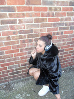
I have chosen to use this image for my final product on the front page, as I thought it was very eye-catching and from a good prospective, which makes it different to the normal photos that we see on magazines which for this reason will catch the target audience eye. Furthermore the use of the headphones in this picture immediately relates my magazine to music. The quality of this photo was very clear and focused also showing the head phones on the female very well something that automatically the audience relate to a music magazine.
I have chosen this image to be placed on my double page spread, as the setting is typical to the stereotypical image of a hip-hop artist, which is important as the audience can then relate themselves to it. Also through the costume of this picture which in reality is the style that most hip-hop artists portray. Furthermore the quality of this photo is very clear and focused.
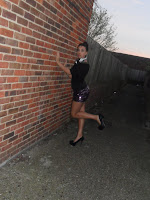
I had chosen to use this image as part of my double page spread as the headline was ‘ghetto too stiletto’ and placed next to this image was a picture shown above of the artists dressed in stereo-typical ghetto clothing and this image showed the artists dressed in the obvious stiletto in order to match the headline. I also like the pose of this picture as it showed some attitude something that is also portrayed through females in the hip-hop genre. Furthermore this photo is again well focused and clear long shot, showing a lot of the setting.
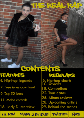
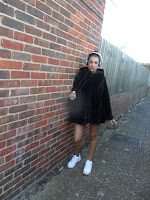
I have chosen to use this photo on my contents page, as I thought that the image with the head phones round the neck really reflected the hip-hop genre in terms of the females who are dressed in expensive clothing but still have the street image. I also thought that the background of this image being a wall and the long alley in the distance helped to add to this. Not only this but the image was clear and a good long shot.
I have chosen to also use this photo to use on my contents page spread as I like the pose that the female is holding which portrays attitude something that most female hip-hop artists are known for. This picture is also very clear and the female is looking into the eyes of the reader which I know is key at catching the eye of the reader.
I had chosen to use this image on my double page spread as I wanted to give the reader an image of the artist inn action. I had liked this picture as you could see the crowd and the lighting of the whole stage with makes the artist on my article look very popular. This picture was taken at a concert when I went to see pink live.
Subscribe to:
Comments (Atom)

